2023/06/26
In order to create a highly sustainable society, Ricoh has pledged to reduce the use of new resources when manufacturing new products. For new digital full color multi-function printers (MFPs), the target set is 50% recycled content.
The MFP is Ricoh's main product. An MFP is big in size and has a big market, so there is great significance in being the first to offer one with such a high percentage of recycled content, and the team in charge of this project was very motivated.
To find out how the new design looks like, go to our previous article.
Using a high percentage of recycled content as well as having to fulfil a large number of other requirements at the same time posed many technical challenges. All the departments involved in the development of this product worked hard to overcome the issues. This was the same for its design department.
Here, I would like to share with you the challenges of designing with recycled materials and how we succeeded, and also the role of the designer and how the designer worked with the other departments to develop the product.
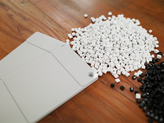
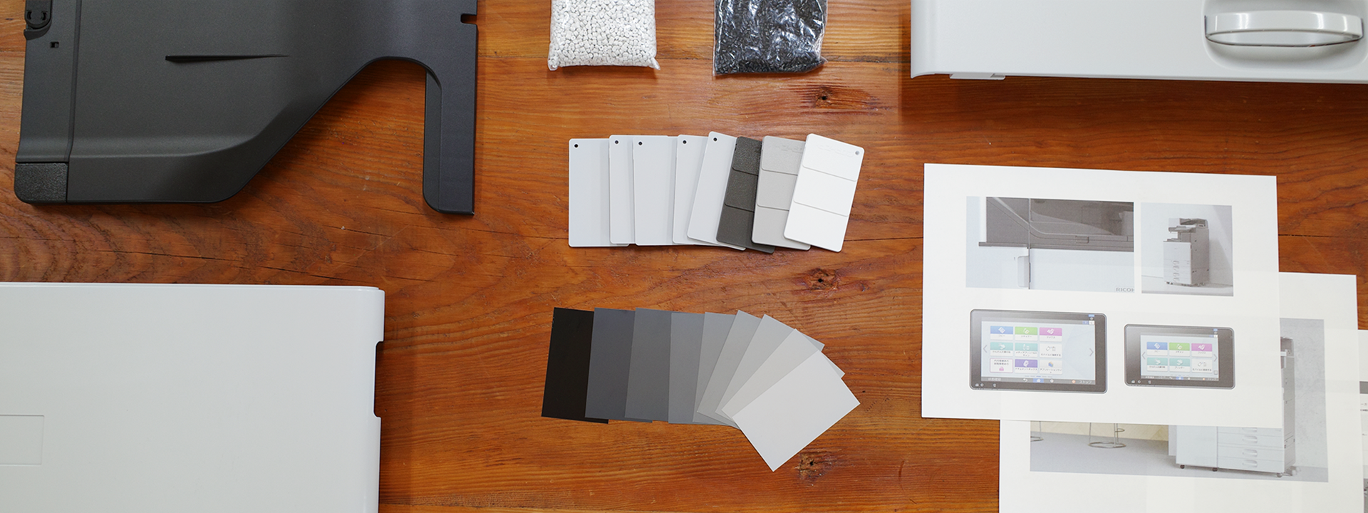
Because recycled plastic is a mixture of used plastic materials, it is relatively easy to make them in dark colors such as gray or black. On the other hand, many people prefer office products to look bright and cheery. We found out that in order to ensure stable supply, there is a limit to how much light-colored recycled plastic we could use for each unit. Because this is the first design using a high percentage of recycled content, it will be the forerunner and set the example for future Ricoh products. Therefore, we also reached out to other departments to work together to decide on the design.
Some suggested that we create a design that instead takes advantage of the weak points of recycled material, such as a lack of bright colors, to show that we are environmental-responsive. However, even though this is part of an effort to reduce impact on the environment, as a designer I felt that we should not compromise, but should ensure that the design and quality meets the expectations of our customers and the workplace. And so, we tried to bring together two different requirements: a design that is environmentally friendly, and a design wanted by the user.
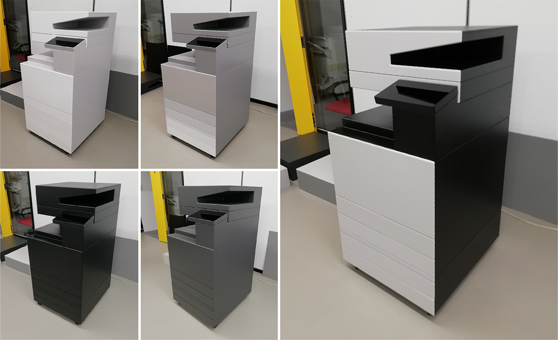
The biggest challenge was deciding the colors. We made a full-scale mock-up of the machine; the sides could be replaced with color panels. Based on the requirements for recycled material, we tried many color combinations. Instead of using CG on a screen, we felt that it was important for us to see the size and colors with our own eyes, just like how the end user will actually see the actual product.
The domestic and overseas sales departments contacted customers and conducted interviews to find out which color themes are favored. The engineering department identified development issues for each plan. We even had a proposal to use light gray throughout, despite a risk of supply running out. However, when I looked at the mock-up, I realized that, because the MFP is big, even if we used light gray, the tone still looks stronger than it actually is, leading to a gloomy and dated impression. After much consideration, we finally decided on a color theme that uses light gray color for eye-catching parts of the exterior such as the front and top, contrasted with black color to make the gray color appear brighter.
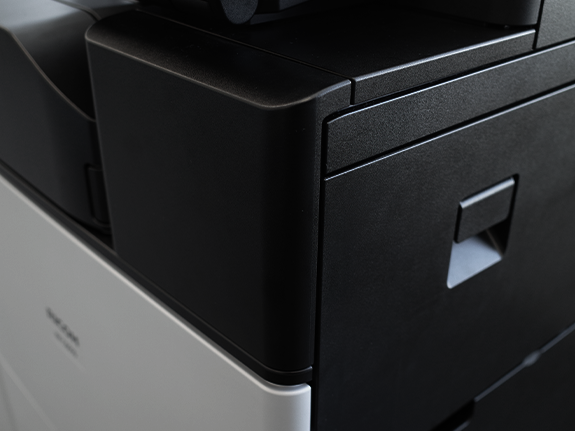
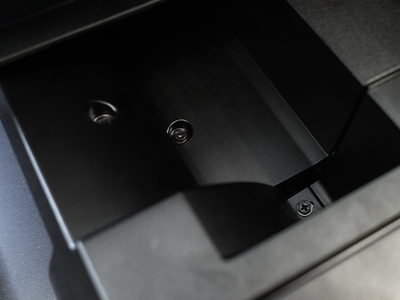
Creating a light gray exterior and a black exterior with the same quality, and using black screws for the black exterior: neither sound special. But in fact, both were very challenging.
This is the first time that Ricoh is shaping a product using so much recycled material. With recycled plastic, it is very difficult to be exact in dimensions; the pieces may not fit closely, or may bend when they are assembled. To make plastic, molten fluid is injected into the mold from multiple openings; the fluid collide resulting in marks on the plastic. Compared to light-colored plastic, these marks tend to be more obvious on black color. To overcome this, we worked with the molding department, consulting them over and over again, and making one prototype after another, until we found the best solution.
Screws visible on the outside are also black in color. The previous model that has the same bright coloring overall needed screws of only one color. Using screws of different colors according to the colors of the exterior gives a matching look, but using more types of screws means more work for the assembly line. And so even for small details like this, a lot of consultation was needed.
Other than the main unit, an MFP has ten or more options to support post-processing, so we faced the same challenges with the options as we did with the main unit. Because each option is designed by a different designer, the designers had to work with each other. So, to me, this product is like a culmination of determination and action, made possible by the cooperation and collaboration of many departments and many people.
Ryuichi Shirane
Product designer for multi-function printers
Also makes websites and videos about design for new MFPs in collaboration with the marketing department.