2023/05/18
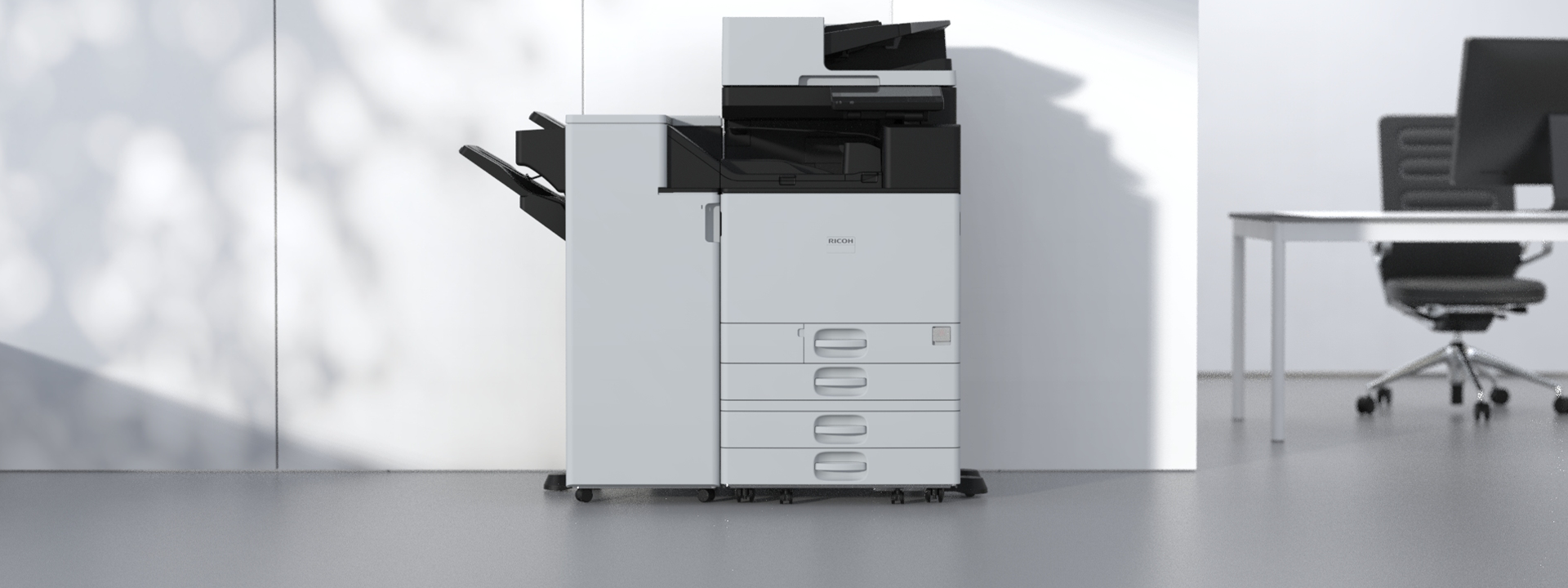
A new design for Ricoh’s A3 color MFPs. Behind this is being the first in the world (*) to attempt using 50 percent recycled content in the such products, as well as a policy shift towards a digital service-oriented company that makes work easier in the DX era. Here we show you the features of the new design that are friendly to Earth and to work.
* Based on research by Ricoh using information registered with EPEAT (U.S.) as of January 25, 2023.
Light gray: Makes possible the high percentage of recycled content and stable supply. Creates a bright impression that harmonizes with office space
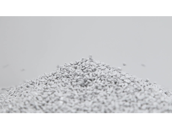
Recycled material made by mixing used materials tend to become darker and duller in color when a lot of it is used. On the other hand, it is preferable for office products to look bright and cheery. We decided on a light gray color that would meet our target rate of recycled content, be stably supplied, and harmonize well with the office space. To prevent the machine exterior from looking gloomy, we applied the light gray color to eye-catching parts such as the front and top surfaces. The color scheme was designed to make the gray color appear brighter by contrasting it with black color.
Black: Solves the problem of how recycled materials look. Makes complex shapes unobtrusive and slim
Recycled material made by mixing used plastic tends to have a grainy look that poses a problem for designers. Using black for the body not only solves this problem, but also makes the dividing lines between covers and the ventilation holes less obvious, realizing a simple and clean look.
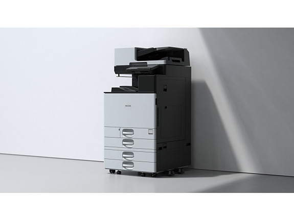
The overall shape uses mainly horizontal and vertical lines that easily blend in with office space and furniture
Not only using black color for the body to make it look clean without complex shapes standing out, but also basing the overall shape on horizontal and vertical lines to match that of walls, floors, pillars, and shelves, creating a design that further blends in with the work space.
Neat and simple light gray cover
The shape of the light gray cover balances well with the black body. It is not too thick, making the cover looks simple both horizontally and vertically. At the same time, to ensure that the black color does not make the machine look heavy and dark, we designed the machine to give a bright and clean impression.
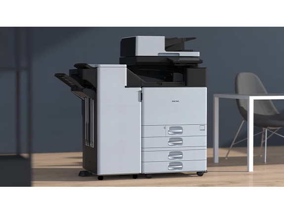
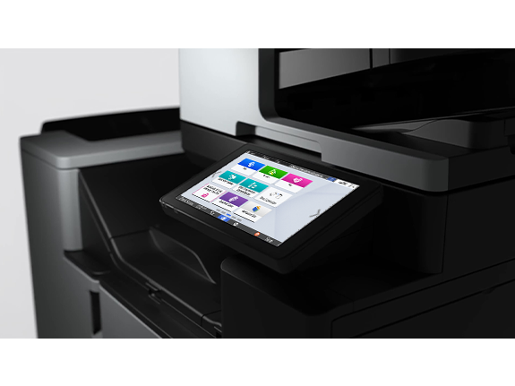
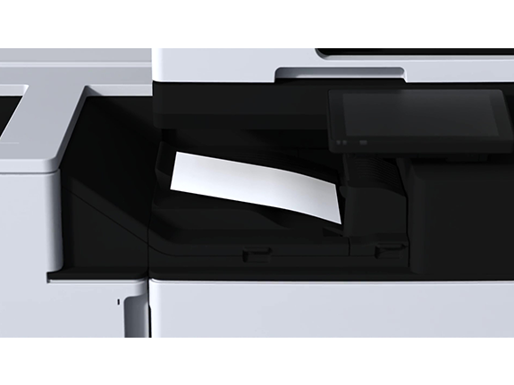
Black body that highlights the control panel screen and paper, because they play leading roles in digital services
The control panel screen, which serves as the entrance to digital services, stands out on the black body. In addition, all paper trays, whether document feed or paper exit, are unified in black, creating a color scheme that makes paper stand out. This same color scheme is also used for the new function for scanning small-size originals such as business cards.
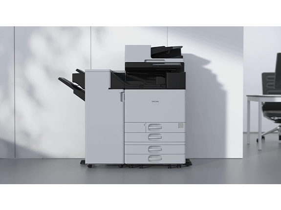
Control panel position enabling smooth operation with easy access to paper
The control panel has been moved to the right side of the machine while maintaining the same screen size. As a result, it is easier to see and remove the paper from the paper exit tray which is at the center of the machine. This design aims to provide comfortable operability for digital services.