2023/03/07

Hello. I’m Yuki Hori.
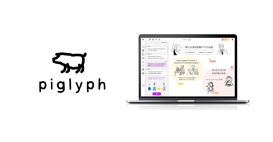
I was in charge of developing the Ricoh service dubbed piglyph. Please allow me to provide you with some details on the platform’s UX/UI design.
Ricoh has been undertaking an initiative involving the providing of assistance for new business launches.piglyph is a new, never-before-seen service born out of that initiative.
While remote meetings and workshops have become more commonplace, there are still challenges that need to be overcome. For instance, both meeting facilitators and participants need to be used to and have the skills necessary to both speak and write things down at the same time. Although emotions and objects are things which can be easily conveyed through illustrations, many give up on drawing things due to their inability to draw them quickly.
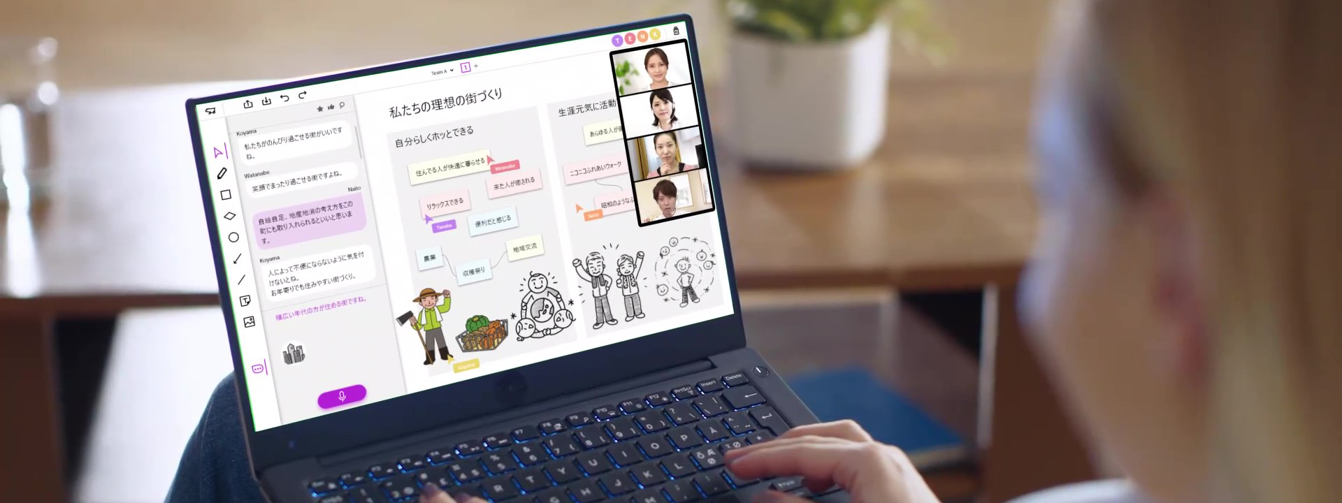
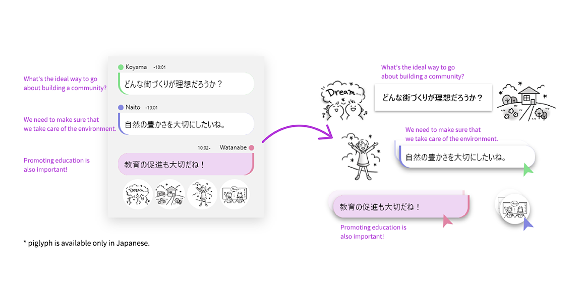
piglyph provides users with real-time illustrations of the content of uttered speech and of words that have been typed out, with suggestions on illustrations being provided on screen. From the list provided, users can select illustrations which best match what they want to convey. They can then place, share and edit illustrations freely. The aim of this platform is to make it easy for users to produce visualizations such as pictures and diagrams and to facilitate communication and lively conversation.
At first glance, the functions of the platform seem simple. However, this is very much a brand-new experience for users since the service has not existed anywhere else in the world thus far. We worked on our design of the platform based on that.
* This product is only available in Japan.
Aiming for an experience that even first-time users would find intuitive without needing manuals.
We thought about how we could go about making the user experience more natural and intuitive so that conversations remain lively without interruption.
Placing illustrations directly below each of the transcribed instances of speech mean that the connection between the instance of speech in question and the illustration provided can be made instantly. Both text and illustrations can be moved to the board (where transcribed text and illustrations can be arranged freely) by dragging and dropping them.
There are also a maximum of eight illustrations provided per instance of speech. We examined the balance to be struck between having too little and too much content provided, as well as in terms of how we could go about ensuring that users enjoy unimpeded conversations while also being able to quickly select illustrations. The platform’s design allows for quick, intuitive interaction and simultaneously provides assistance to participants when it comes to creating visualizations of the conversation. This makes for an ingenious way to maintain the integrity of conversations themselves.
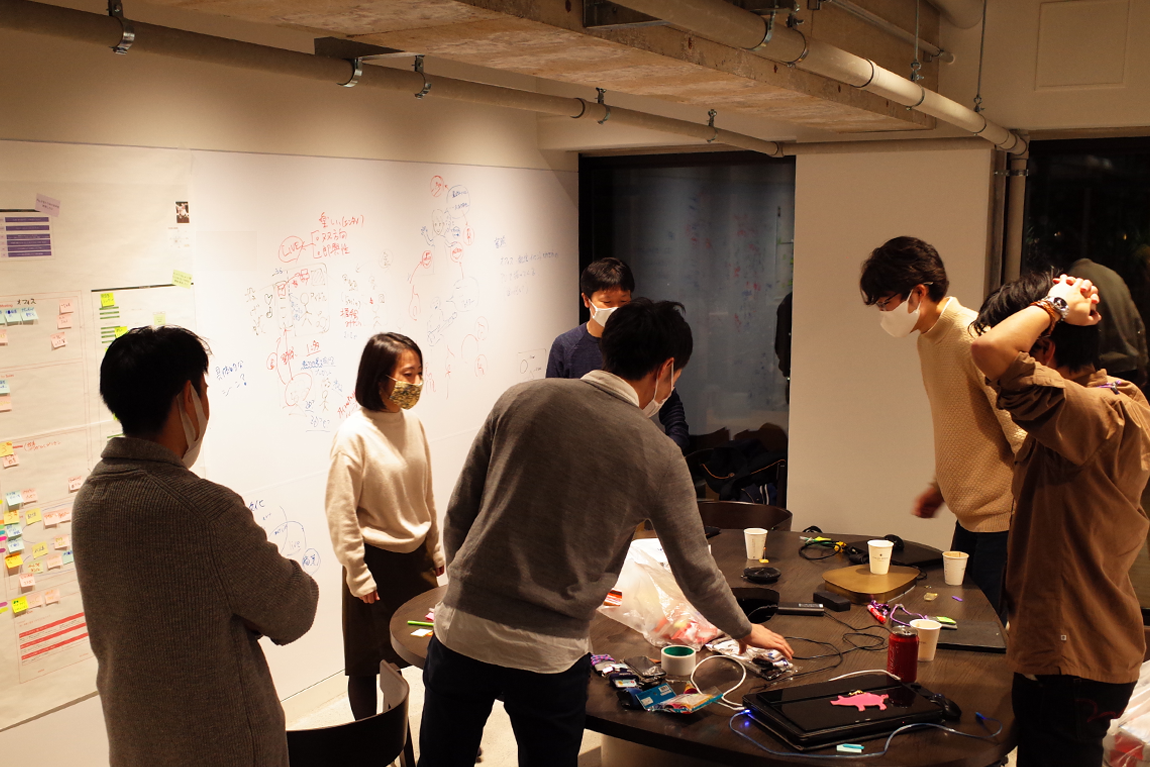
Signs like emoticons serving as expressions of emotions and “Like” signs signifying agreement with something, are shown in the form of a list and are selected by clicking the icons on the right side of the screen. I observed many meetings where illustrations were used, such as those involving graphic records kept for those meetings. There, we would often go about identifying the most frequently used illustrations. Since those illustrations are used frequently, the platform makes it so that users do not have to go out of their way to rephrase things or search for the right illustration during their meetings.
When considering the design, we would try to put together as detailed a map as possible when it came to what the user wants to do. Then, we would make it clear what kind of UI would be needed for each individual item. This is to ensure that the operations which allow users to achieve what they want are all connected within the flow that exists in terms of the UI so that the user experience ends up being both natural and intuitive.
A design which raises expectations and does not disappoint.
There are two important points to introduce here.
・The color system also provides users with colors that are both fresh and calm.
・The design is both simple and reliable, and is suitable for business and educational use. When it comes to illustrations and diagrams, the platform is not overly biased toward cheerful images.
We produced a design that even first-time users can rely on and come to expect lots from. The colors we adopted are not only fresh in terms of appearance, but also designed to function as quick visual indicators of which UI is to be operated even as the number of on-screen illustrations increases.
The platform’s design was also engineered with businesspeople and educational users in mind, meaning that we did our best to ensure a sleek interface with as few on-screen elements as possible.
As a designer, I was involved in more than just the screen UI. I was also involved in lots of other elements, such as the logo, instructional videos, website directions, and so on. I have been in charge of designing the entirety of the medium through which the user experience takes place.
Creating the platform together with users.
piglyph users have responded positively to the platform, saying it’s both engaging and enjoyable to use. I have also found myself surprised at the fact that some frequent piglyph users are not only facilitating the conversations taking place on it, but they are also making excellent use of the illustrations and organizing their boards quite beautifully.
piglyph is all about getting users to interact with the platform quickly and repeatedly. We are continuing to come out with version updates. Having users actually interact with the platform helps us ascertain which elements are used often and which are not. I do get the feeling that we will be able to make the UI sharper, simpler and easier to use.
Sometimes there are things that you only notice after you get users to interact with the platform. That is where new ideas come about. We actually have lots of ideas which came about in that manner and our plan is to continue incorporating those ideas into the service and provide updates to the platform.

Yuki joined Ricoh as an experienced professional.
He is engaged in the area of UX/UI design in a wide range of fields, including multifunction devices and cloud services, as well as new business services.