
2019/08/07
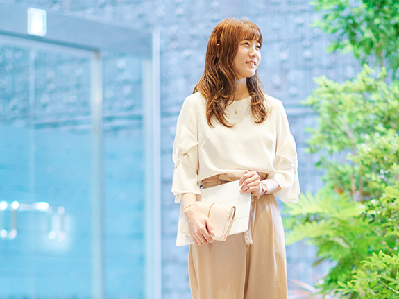
Kanako Ishigure
Product Designer
Joined 2017
Assigned to new-product development team ten months after joining Ricoh
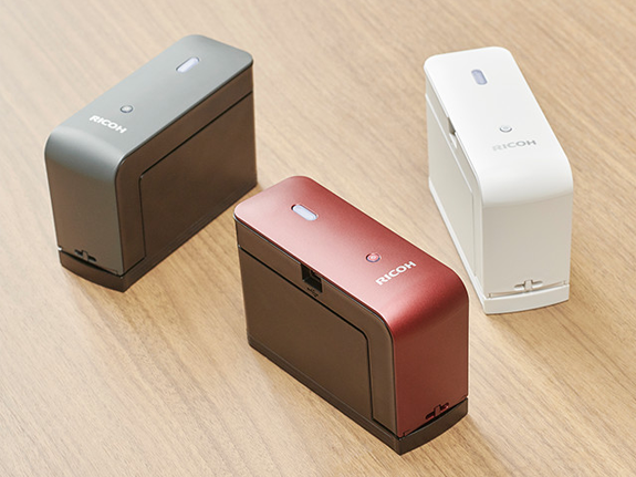
In 2019, Ricoh added a new page to the history of printers. The name of the product is “RICOH Handy Printer.” It is an ultra-small inkjet printer weighing only 315 grams, which is about the same as one apple. Offering portable and cordless operation, it can print on vertical surfaces as well as notebooks and cardboard that cannot be fed through a standard printer.
I participated in the development of this product starting from about my tenth month at Ricoh. As my role on the development team, the person in charge of the exterior design assigned me to work on color variations and surface processing. This distinctive printer represents a new product category for Ricoh; namely, a product that is for business use but that can also be utilized on an everyday basis by consumers. It may be that I was asked to join the team in the expectation that, as a new employee, I might be a source of “outside-the-box” ideas. Personally, I was thrilled to be asked to join since I have a longstanding interest in work involving the uses of color.
The fact is, at the time I came on board, a decision had not been finalized as to whether the use of multiple exterior colors would be necessary for potential customers outside the main target market of business users. However, particularly because this is new category of product, it was finally decided that we should use color as to tool for targeting a wide range of customers. So, a major theme for our efforts was to use color to communicate the feeling of excitement generated by this totally new printing experience.
Concepts embodied in white, black, and red
The first thing I did was to investigate the surface processing used for all types of palm-of-the-hand size products. For example, this included trips to large electrical product retail stores to research trends with respect to the finishing used for the handheld surfaces of everything from digital gadgets to electrical appliances for health and beauty use. I looked at the manufacturing processes that could produce those surfaces, researched the costs involved, and presented the information in our weekly design review meetings. Partly because those meeting were sometimes held via videoconferencing between the Corporate Design Center, where I work, and other locations, I made a special effort to not only clearly present my own ideas but also to always grasp and visualize the ideas of other project members.
The consideration of color variations and target markets proceeded simultaneously, and three colors were selected: white and black primarily for business users and red for targeting consumers. As it projects a feeling of cleanliness, we felt that white would be used in medical settings such as home-visit nursing care, and black projects a feeling of strength and soiling resistance so we assumed it would be useful in the distribution and warehousing industry. Of course, the most important thing is that users are free to select their own preferred color.
In addition to red, we also examined light colors such as gold and pink, but red was selected as a color that would look good next to white and black when seen in stores and in product photographs on websites. Comparing dozens of shades of red, we selected one we thought would appeal to the kinds of users who would be interested in this product. In our approach to the color-selection problem, we took into account the kinds of tools that people carry as well as their bags/cases, clothing, and living spaces. To avoid creating too much of an “office product” image and to create a high-class feel consistent with the price range, a lamé-accented deep red was chosen.
It seemed to me that red and black have been popular with electronic gadget early adopters in every era. Going as far as to consider color affinity with the human hand and examine how the colors look in images viewed on video sites and SNS, we fine-tuned the shade of red in repeated discussions with the company handling the painting. By using black for the resin that serves as the undercoating, we were able to obtain an even deeper and richer red. Finally, after about five months of effort, the “go sign” was received for the color variations and surface processing.
After launch, the response was even better than expected
Immediately before and after the start of sales, it was the red model that received the most attention in the media as well as on YouTube and large EC sites. So I think that we achieved our objective of using color to spark interest among a wide range of people.
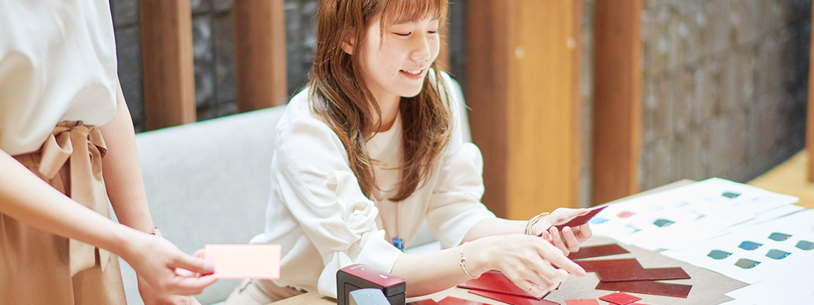
In activity centered on Twitter, there have also been an increasing number of customers presenting information on surprising ways in which this printer can be used. For example, one person reported “linking a speech system with the RICOH Handy Printer.” All the members of the development team were deeply moved the day we found a tweet saying that a child who had difficulty writing because of a disability was able to take a test at school by using this printer. The checking of SNS continues to be a daily task, and I share the valuable comments with our team as part of preparation for product enhancements.
In addition to the reaction in Japan, we are also receiving an increasing number of inquiries from overseas. In the past, Ricoh has sold gold-color multifunction products in the Chinese market. I think it would be a good idea for us to continue to utilize color in ways tailored to specific cultures.
The great thing about this product is that, even though it just prints text and patterns, it can do an endless number of things depending on how it is used. I think it would be wonderful if in the years ahead we can continue to develop the “product experience” together with customers sharing information on the fascinating ways in which this printer is used around the world.
A place to firm up my foundation as a designer
Since my time as a student, it has been my desire to utilize approaches not limited to color and form in order to create things that make the people who use them happy. This product is the perfect embodiment of that desire. What it offers is a new printing experience using a totally different printing action. The RICOH Handy Printer enables you to do what you want to do by printing what you have never been able to print before.
This experience has made it painfully clear that the beautiful finishing of the visible surfaces of a product is an obvious requirement for a designer, and that I must further deepen my knowledge of how this is done. I do not yet have an adequate foundation of knowledge concerning how to make products so that they can be sent out into the world. All the necessary information concerning manufacturing technologies and the difficulties faced in producing colors was kindly provided to me by my Ricoh colleagues and people from the collaborating companies. Building on this experience, I want to continue to learn skills from others while gradually giving form to my own design concepts.

One day of Ishigure
10:00
Arrive at office; check email
10:30
Consider design; snack
12:00
Lunch
13:30
Go to Technology Center
15:00
Discussions with design area
16:00
Snack
16:30
Check actual product
18:30
Leave office