Country/Area Selector
Skip to main content
First level navigation
About RICOH
About RICOH
Vision
Vision
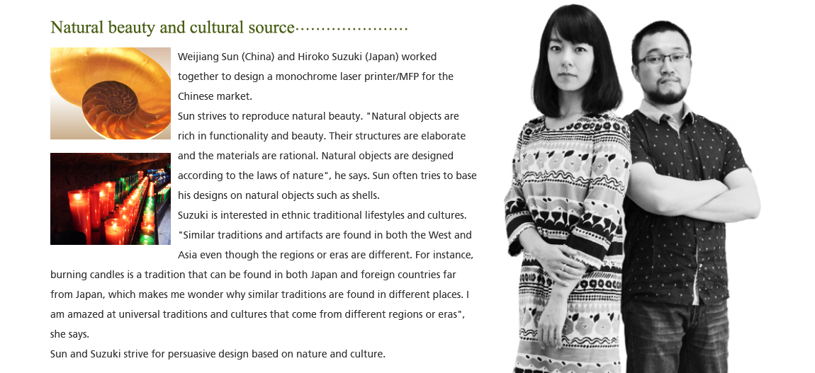
To Our Stakeholders
Corporate Philosophy “Ricoh Way”
Corporate Profile
Corporate Profile
Company Data
Business
The Board
Global Network
Company History
Ricoh at a Glance
Directory
Directory
Sales and Services
Research and Development
Manufacturing
Ricoh Co., Ltd. Operations
Integrated Report
Advertising / Publications
Advertising / Publications
Advertising
Corporate Videos, Corporate Publications
Careers
Investor Relations
Investor Relations
Corporate Strategy
Corporate Strategy
To Our Stakeholders
Mid-term Strategy
Dividends
Corporate Governance
IR Events
IR Events
Financial Announcement
Corporate Strategy Meeting
Business Briefing/ESG Briefing
General Meeting
Dialogue between Outside Directors and Shareholders
Event Calendar
IR Library
IR Library
Financial Results
Securities Reports
Integrated Report
FAQ
Financial Data
Financial Data
Selected Consolidated Financial Data
Consolidated Statement of Cash Flows
Sales by Product Category and Area
Key Financial Figures, Per Share Data
Stock & Corporate Bonds
Stock & Corporate Bonds
Stock Information
Corporate Bonds and Ratings
Dividend Policy
Sustainability
Sustainability
Sustainability at Ricoh
Sustainability at Ricoh
Message from the CEO
Basic Concept and Structure of Sustainability
Materiality for the Ricoh Group
Reports on Ricoh's ESG
Reports on Ricoh's ESG
Integrated Report
ESG Data Book
TCFD Report
Circular Economy Report
ESG Data
GRI Standards Index
Third-Party Verification Report
Commitment and Recognition
Involvement in Initiatives and Advocacy Activities
Stakeholder Engagement
Environment
Environment
Environmental Management Systems
Environmental Management Systems
Vision and Concept
Environmental Goals (for 2030 and 2050)
Structures and Systems
ISO14001 Certification
Achievement of a Zero-Carbon Society
Achievement of a Circular Economy
Effective Use of Water Resources
Prevention of Pollution
Conservation of Biodiversity
Environmental Information of Our Products
Environmental Information of Our Products
Ricoh Sustainable Products Program
Enviromental Labels
List of Environmental Label Qualified Products
Safety Data Sheet (SDS)
Reuse and Recycling Program
Green Procurement
Society
Society
Ricoh Way and Human Resource Management
Diversity & Inclusion and Work-Life Management
Human Rights
Human Resource Development
Occupational Safety and Health
Customer Satisfaction
Supply Chain Management
Social Contribution Activities
Governanance
Governanance
Corporate Governance
Compliance
Risk Management
Innovation Management
Trade Control
Information Security
Information Security
Product Security
Corporate Security
Products
Technology
Technology
Development
Development
Optimal Support for Your Work Using AI
The Expansion of Ricoh's Inkjet Technology
Initiatives in Intellectual Property
Ricoh's Technology
Ricoh's Technology
By field
By field
Printing
Optics / Image Processing
Software
Environment
Production / Analysis / Control
Materials / Devices
By product type
By product type
Office Printing
Office Services
Commercial Printing
Industrial Printing
Industrial Products
Solutions for Society
Feature Stories
Feature Stories
FrontRunner
NHK's “NIGHT OF THE MAKAIZO SOCIETY”--A close look at Ricoh developed machine
RICOH Design
Support & Downloads
News
News
News Release
Information
Stories
Menu
Home
S
Global
Home
Technology
RICOH Design
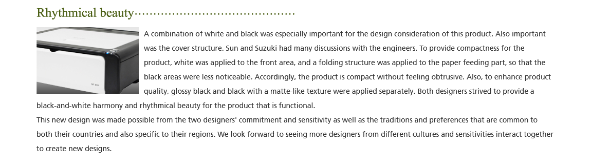
New product design based on different cultures and sensitivities
Japanese
New product design based on different cultures and sensitivities
#Designers
#Product Design
2012/11/29
HOME
TOP
Home
Technology
RICOH Design
New product design based on different cultures and sensitivities